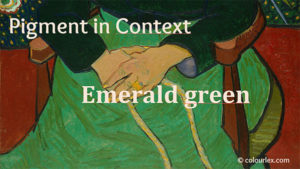
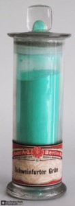
Emerald green
Composition and Properties of Emerald Green
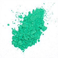
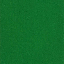
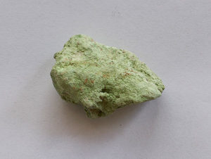
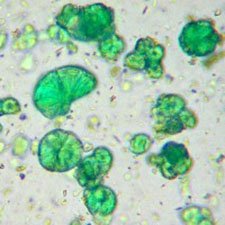
Emerald green is copper (II)-acetoarsenite: 3 Cu(AsO2)2·Cu(CH3COO)2. It has been valued by the painters of the 19th century for its vivid tone and excellent stability. Later on, the production has been halted due to the extreme toxicity of the pigment. Emerald green is soluble in acids and alkalis and can also be hydrolyzed by prolonged contact with water. The pigment is not very lightfast Emerald green darkens in contact with sulfur compounds such as cadmium sulfide (cadmium yellow).
Names of Emerald Green
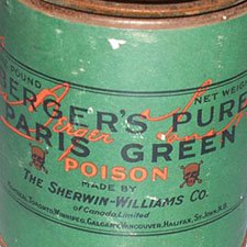
Paris green, Veronese green, Schweinfurt green, Mitis green, Vienna green, Imperial greenPG 21, CI 77410From Old French esmeraude (12c.), from Medieval Latin esmaraldus, from Latin smaragdus, from Greek smaragdos “green gem” (emerald or malachite), from Semitic baraq “shine”. From WordFinder
Preparation of Emerald Green
Attention: Emerald green is highly toxic and should not be used by people not trained to handle it.Emerald green can be prepared by a reaction of sodium arsenite and copper(II) acetate or alternately, by a reaction of sodium arsenite, copper II sulfate, and acetic acid.Here is a recipe from the 19th century:‘Dissolve in a small quantity of hot water, 6 parts of sulphate of copper; in another part, boil 6 parts of oxide of arsenic with 8 parts of potash, until it throws out no more carbonic acid; mix by degrees this hot solution with the first, agitating continually until the effervescence has entirely ceased; these then form a precipitate of a dirty greenish yellow, very abundant; add to it about 3 parts of acetic acid, or such a quantity that there may be a slight excess perceptible to the smell after the mixture; by degrees the precipitate diminishes the bulk, and in a few hours there deposes spontaneously at the bottom of the liquor entirely discolored, a powder of a contexture slightly crystalline, and of a very beautiful green; afterwards the floating liquor is separated.’ The mineral conichalcite has a similar chemical composition as emerald green, even though it has never been used as a pigment.
History of Use
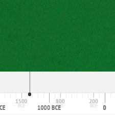
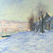
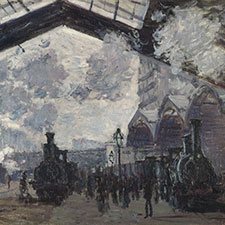
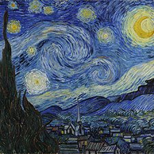
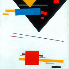
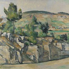
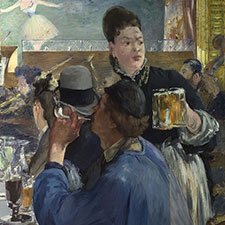
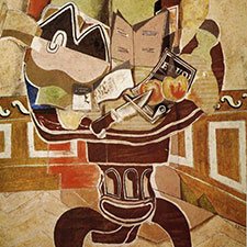
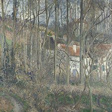
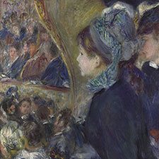
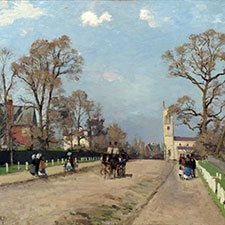
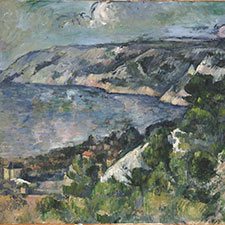
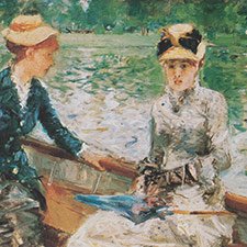
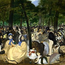
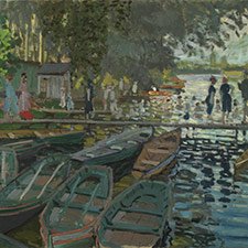
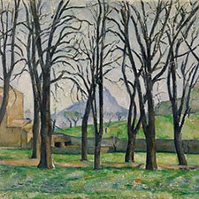
Emerald green has been in use since its discovery in the first quarter of the nineteenth century. It was discontinued sometime in the second half of the twentieth century due to its toxicity. The following graph gives the frequency of its use in the paintings of the Schack Collection in the Bavarian State Art Collections in Munich (1).An extensive collection of occurrences of this pigment in paintings from several historical periods can be found in the blog post ‘Pigment: Poison Greens‘ by The Eclectic Light Company.References(1) Kühn, H., Die Pigmente in den Gemälden der Schack-Galerie, in: Bayerische Staatsgemäldesammlungen (Ed.) Schack-Galerie (Gemäldekataloge Bd. II), München 1969.Example of use
Quote
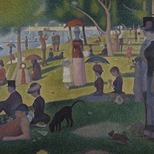
On Pissarro's advice I'm abandoning the emerald green.. Seurat's note in 1885; as quoted in the exhibition-text 'Georges Seurat, 1859 – 1891' in The Metropolitan Museum of Art, New York, 1992, ed. Robert Herbert, published: Harry N. Abrams, Inc., New York (Camille Pissarro wrote his son Lucien c. 1885 and asked him to warn Seurat and Paul Signac, because mixing the cadmium yellow with other pigments would change into dark color, later)
Source: Georges Seurat
It is generally admitted that the most beautiful qualities of a color are in its transparent state, applied over a white ground with the light shining through the color. A modern Kodachrome is a delight when held up to the light with color luminous like stained glass. So many ask what is meant by transparent color, as though it were some special make. Most all color an artist uses is transparent: only a few are opaque, such as vermillion, cerulean blue, emerald green, the ochres and most yellows, etc. Colors are applied just as they come from the tube, the original purity and quality is never lost: a purple is pure rose madder glowing through a glaze of pure blue over glaze, or vice versa, the quality of each is never vitiated by mixing them together. Mix a rose madder with white, let us say, and you get a pink, quite different from the original madder, and the result is a surface color instead of a transparent one, a color you look on instead of into. One does not paint long out of doors before it becomes apparent that a green tree has a lot of red in it. You may not see the red because your eye is blinded by the strong green, but it is there never the less. So if you mix a red with the green you get a sort of mud, each color killing the other. But by the other method. when the green is dry and a rose madder glazed over it you are apt to get what is wanted, and have a richness and glow of one color shining through the other, not to be had by mixing. Imagine a Rembrandt if his magic browns were mixed together instead of glazed. The result would be a kind of chocolate. Then too, by this method of keeping colors by themselves some can be used which are taboo in mixtures. Letter to F.W Weber (1950); as quoted in Maxfield Parrish by Coy Ludwig (1997)
Source: Maxfield Parrish
Delirium was once Delight. And although that was long ago now, even today her eyes are badly matched; one eye is a vivid emerald green, spattered with silver flecks that move; her other eye is vein blue. Who knows what Delirium sees, through her mismatched eyes? Sandman #21: "Season of Mists", preludium
Source: The Sandman
The Taj Mahal is one of the seven wonders. My guide assures me that it is 'perhaps the most beautiful building in the world.' Following its advice, we drove out to have our first look at the marvel by the light of the setting sun. Nature did its best for the Taj. The west was duly red, and orange, and yellow, and, finally, emerald green, grading into pale and flawless blue towards the zenith. Two evening stars, Venus and Mercury, pursued the sunken sun. The sacred Jumna was like a sheet of silver between its banks... Nature, I repeat, did its best. But though it adorned, it could not improve the works of man. The Taj, even at sunset, even reverberated upside down from tanks and river, even in conjunction with melancholy cypresses— -the Taj was a disappointment... My failure to appreciate the Taj is due, I think, to the fact that, while I am very fond of architecture and the decorative arts, I am very little interested in the expensive or the picturesque, as such and by themselves. Now the great qualities of the Taj are precisely those of expensiveness and picturesqueness, Milk-white amongst its dark cypresses, flawlessly mirrored, it is positively the Toteninsel of Arnold Boecklin come true... The Taj itself is marred by none of the faults which characterize the minarets. But its elegance is at the best of a very dry and negative kind. Its ‘ classicism ’ is the product not of intellectual restraint imposed on an exuberant fancy, but of an actual deficiency of fancy, a poverty of imagination. One is struck at once by the lack of variety in the architectural forms of which it is composed. There are, for all practical purposes, only two contrasting formal elements in the whole design — the onion dome, reproduced in two dimensions in the pointed arches of the recessed bays, and the flat wall surface with its sharply rectangular limits. When the Taj is compared with more or less contemporary European buildings in the neo-classic style of the High Renaissance and Baroque periods, this poverty in the formal elements composing it becomes very apparent. ... But it is made of marble. Marble, I perceive, covers a multitude of sins. Aldous Huxley, Jesting Pilate
Source: Taj Mahal
Nick Hewer: Behind me, you can see Stella wearing a very short, sequinned, emerald green dress, waving at people from a window. Amsterdam, maybe, but not in Manchester.
Source: The Apprentice (British TV series)