Cerulean blue
Composition and Properties of Cerulean Blue
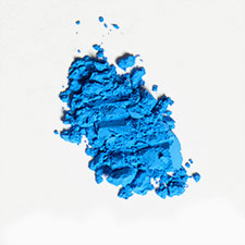
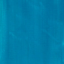
Cerulean blue is cobalt-(II)-stannate with the formula of CoSnO3 or more generally CoO · n SnO2. The pigment is very stable and it does not change under illumination.
Names
ceruleum blue, caeruleumPB 35, CI 77368“Sky-colored, sky-blue,” 1660s, with -an + Latin caeruleus “blue, dark blue, blue-green,” perhaps from a dissimilation of caelulum, diminutive of caelum “heaven, sky,” which is of uncertain origin.From Online Etymology Dictionary
Preparation
The pigment can be prepared by heating a mixture of cobalt-(II)-chloride and potassium stannate.
History of Use
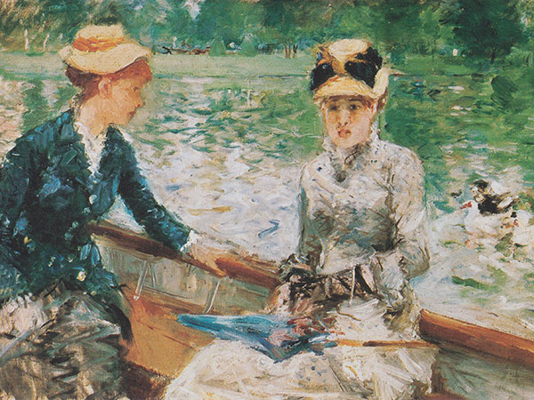
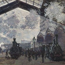
Cerulean blue was first synthesized in 1805 and was used mainly for painting skies due to its light blue colour and excellent stability.Examples of use
Quote
It is generally admitted that the most beautiful qualities of a color are in its transparent state, applied over a white ground with the light shining through the color. A modern Kodachrome is a delight when held up to the light with color luminous like stained glass. So many ask what is meant by transparent color, as though it were some special make. Most all color an artist uses is transparent: only a few are opaque, such as vermillion, cerulean blue, emerald green, the ochres and most yellows, etc. Colors are applied just as they come from the tube, the original purity and quality is never lost: a purple is pure rose madder glowing through a glaze of pure blue over glaze, or vice versa, the quality of each is never vitiated by mixing them together. Mix a rose madder with white, let us say, and you get a pink, quite different from the original madder, and the result is a surface color instead of a transparent one, a color you look on instead of into. One does not paint long out of doors before it becomes apparent that a green tree has a lot of red in it. You may not see the red because your eye is blinded by the strong green, but it is there never the less. So if you mix a red with the green you get a sort of mud, each color killing the other. But by the other method. when the green is dry and a rose madder glazed over it you are apt to get what is wanted, and have a richness and glow of one color shining through the other, not to be had by mixing. Imagine a Rembrandt if his magic browns were mixed together instead of glazed. The result would be a kind of chocolate. Then too, by this method of keeping colors by themselves some can be used which are taboo in mixtures. Letter to F.W Weber (1950); as quoted in Maxfield Parrish by Coy Ludwig (1997)
Source: Maxfield Parrish
Let us watch this de Kooning [Dali comment here the 'Woman' paintings, Willem de Kooning painted in the early 1950's] with his prematurely white hair making his great sleepwalker's movements, as though he was waiting in a dream to open bays of Biscay, to explode islands like pieces of orange or Parma violets, to tear continents from a cerulean blue split by oceans of Naples yellow.. ..if by good or by ill fortune, in the middle of this Dionysian demiurg the image of 'The Eternal Feminine' should appear.. ..the least that might have happened to her would be that she should emerge (from all this chaos) wearing nothing but a little make-up. Quote of Salvador Dali in Dali and Me, Catherine Millet, (translation, Trista Selous), Scheidegger & Spiess AG, 8001 Zurich Switzerland, p. 135
Source: Willem de Kooning
Let us watch this de Kooning [leading Abstract-Expressionist painter in New York] with his prematurely white hair making his great sleepwalker's movements, as though he was waiting in a dream to open bays of Biscay, to explode islands like pieces of orange or Parma violets, to tear continents from a cerulean blue split by oceans of Naples yellow.. ..if by good or by ill fortune, in the middle of this Dionysian demiurg the image of 'The Eternal Feminine should appear.. the least that might have happened to her would be that she should emerge (from all this chaos) wearing nothing but a little make-up. Dali's comment on the 'Woman-paintings', c. 1960 [a.o. Woman-III ] of the American abstract-expressionist painter Willem de Kooning: (MPC 75); as cited in Dali and Me, Catherine Millet, (translated by Trista Selous), Scheidegger & Spiess AG, 8001 Zurich Switzerland, p. 135
Source: Salvador Dalí
Cinematographer Matthew Jensen, production designer Aline Bonetto, and costume designer Lindy Hemming form Themyscira into a gorgeous utopia that utilizes a variety of cultural touchstones. It’s free of the Hellenic influence you’d expect from a story that takes such inspiration from Greek myth with the Amazons creating their home in a way that respects the lush nature around them rather than destroying it. It isn’t sterile either. The scenes set in Themyscira have a dazzling array of colors including the gold of armor, the cerulean blue of the sea that surrounds them, warm creams, and deep browns. Jenkins films many of these scenes in wide shot, reveling in the majestic nature of this culture. Similarly, the history of the Amazons, told in a dense but beautifully rendered backstory by Hippolyta, evokes a painterly quality reminiscent of Caravaggio.
Source: Wonder Woman (2017 film)